-ARTISTS RESEARCH-

ALPHONSE MUCHA

I love the Art Nouveau’s style of work – the sinuous flowing lines, the decorative borders, the undulating lines and the curving, organic forms. Therefore I wanted to do something along those lines in my project. Many of my designs were inspired by Mucha, for instance I took inspiration of the exquisite tendrils, undulating lines, whiplash curves, organic figures and added my own twist. I appreciate how the above elements offer a feeling of whimsical and elegance.

All of Mucha’s designs will portray women as beautiful and desirable beings. Women were a frequent theme in Art Nouveau, since feminine figures were the favourite subject, it functioned as both metaphorical and decorative reasons. Mucha held femininity in high regard considering such concept acts as a cure to an exceedingly industrialized, masculine society. He also viewed circles as utterly the most ideal and flawless shape in nature, therefore he manipulated bordered rings constantly. The use of scrupulous ornamentation is also one of the key elements in Mucha’s designs. He ensures that the background of his posters is as attentively crafted as possible as the protagonist.

Fig. 1 Nestlé’s Food for Infants by Alphonse Mucha (1897)

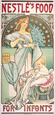
Nestlé’s Food for Infants (72 x 34.5 cm) is a poster, lithograph printed in colours, produced by Alphonse Mucha from the year 1897. Its characteristic motifs involve exquisite tendrils, undulating lines, whiplash curves, organic figures, sensuous curves and exotic bodies, such elements offer a feeling of whimsical and elegance. Such poster portrays the sophisticated yet structural elements of Art Nouveau. The poster features muted, pastel colours with crimson and olive-green handwritten serif style font at the top and bottom page. The protagonists are the young woman standing on the left and the baby sitting on a baby rocker chair on the bottom right. The lady is wearing a drapery Greek inspired outfit – cream sleeveless dress with a long, subdued tiffany blue fabric wrapped around her body. The smiling blonde baby is also wrapped in a long cream fabric.

WILLIAM MORRIS

William Morris (1834 – 1896) is one of the 19th century’s most influential designer and key figure from the Arts and Crafts era (V & A, 2019). His designs and patterns for textiles and wallpapers were revolutionary. As a reaction against the cheapening of labour and goods, artists started to express a desire to return to a more noble time (Medieval/Gothic) where craftsmanship were appreciated, in which gave rise to the Arts and Crafts movement (1850 – 1900). 

Morris once said, “Soulless objects for soulless people” and “Fellowship is heaven and lack of fellowship is hell” (BBC2, 2019). He believed that mass manufactured objects are soulless objects for the soulless people. He advocated the handmade creation, filled with love, care and cherished by its owners. He held craftsmanship and traditional methods of dyeing and printing in high regard. He wanted to bring soul and pride back to handmade objects for the expanding middle class. To this day, Morris’ work can still be found in the public, for instance, in high-end department stores like John Lewis.

Strawberry Thief is a printed wallpaper designed by William Morris in 1883. Strawberry Thief was printed through utilising handmade wooden blocks packed with natural dyes.  This printing method is a complex printing technique that required many individual printing blocks (V & A, 2019). Wallpapers were in subdued and muted colours since only organic pigments were used in the process of making. Morris declined the harsh chemical of aniline dyes, preferring the richness of natural dyes from rocks, plants and vegetables.

Fig. 1 Own Photograph 2019

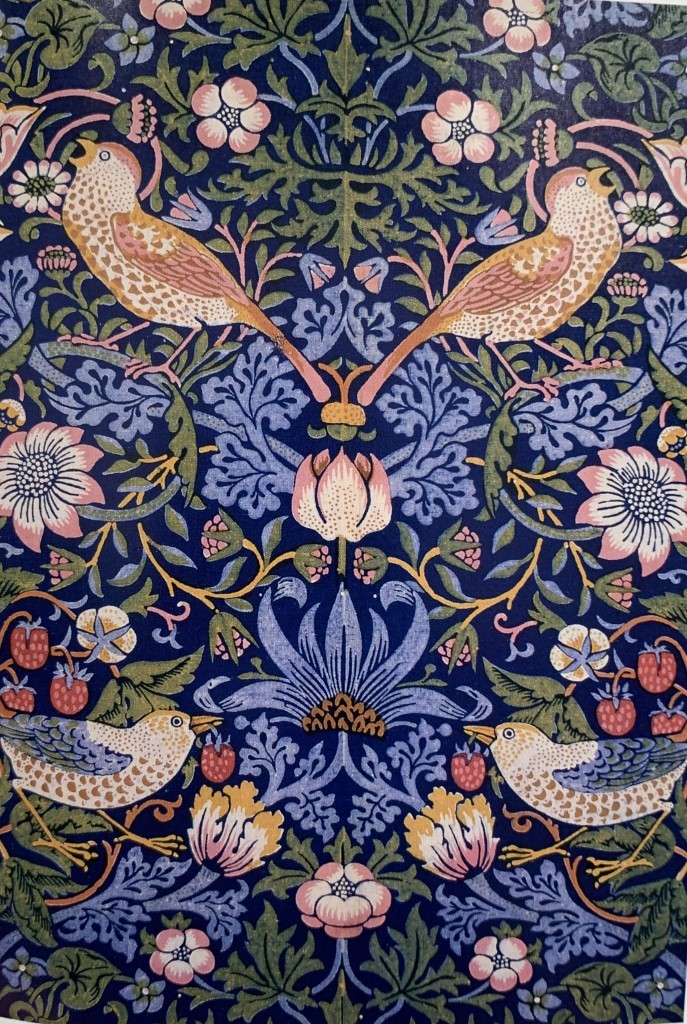
As one may tell from Fig. 1, there are two types of brown and blue thrush birds on a plain dark indigo background. There are also red strawberries, green or indigo leaves and three sorts of flowers in different proportions. Strawberry Thief is mostly set in the cool hue of blues, for instance there are both dark blue and light indigo. In contrast to the cool tones of blue and green, there are the warm hues. Consisting a hint of red, yellow, brown and pink visible in the birds, strawberries and flowers. Elements such as the thrushes, strawberries, flowers, leaves and vines are arranged symmetrically. Therefore, created harmony and balance as well as symmetry and repeats are used to create patterns. The emphasis is naturally made on the thrushes because they are bigger in scale, the naturalism, they’re eye-catching and especially detailed. The repetition of the elements gives the work a sense of unity, while the differences between the flowers and colours in the pattern offers variety. Delicate, thin lines and organic, natural shapes were applied in the work.

In my subjective opinion, I admire Morris’ ability to organise various elements in the artwork yet maintain a balanced composition. It is satisfying to look at because almost each element in the artwork is perfectly balanced against each other. I like how all the elements fused together seamlessly to create this work. All the elements worked well with each other to create a perfect, harmonious and well-balanced design. I love the intricacy and complexity of the design, it is abundant yet, not chaotic. I feel like I would never get bored of looking at this design, since it’s very interesting and elegant. I like how the artwork is a reflection of the time period, I could see the hatred of mechanization and the love for nature.

List of References:

The Victorian House of Arts and Crafts, 21:00 11/01/2019, BBC2 England, 60 mins. https://learningonscreen.ac.uk/ondemand/index.php/prog/12AAB2EC?bcast=128267523 (Accessed 20 May 2019)  

Victoria and Albert Museum. (2019). Introducing William Morris. https://www.vam.ac.uk/articles/introducing-william-morris

Victoria and Albert Museum. (2019). William Morris and wallpaper design. https://www.vam.ac.uk/articles/william-morris-and-wallpaper-design

-ART + DESIGN DEGREE SHOW-

This week, I have visited the NTU art and design degree show at the Arkwright building, Bonington building, Newton building and Waverley building. I have viewed numerous artworks from various department of art and design, for instance, graphic design, decorative arts, furniture & product design, fine art, textile design as well as costume design.

Graphic design degree show at Arkwright building

I didn’t know graphic design could be this broad. Before the show, I have always thought that graphic design only deals with typography, identity (logo and branding), illustrations and advertisements. However during the show, I saw a couple of graduates did brochures, miniature models, embroidery, photography, ceramics, concrete and even clothing. This show has really broaden my horizons on the graphic design industry. I thoroughly enjoyed viewing the graduates’ artworks and sketchbooks as they are very fascinating, I can see all the hard work and effort that was put into the projects. Furthermore, some of the works has given me some inspiration for my own project.

-Graphic Design-

-Textile Design-

-Fine Art-

JIHYE YUN

Not Your Toy

“Animal sculptures are inspired by abandoned animal. They are likened to ‘old and broken toys’, and plants, ‘Cordyceps militaris’ where grow on dead insects to express their wounded heart and bodies. ” 

-Jihye Yun
Inspiration no. 1

Jihye (also known as Kate) Yun’s project, Not Your Toy, is a collection of ceramic sculptures produced from the inspiration of abandoned animals. Abandoned animals are comparable to broken old toys – undesirable, unappreciated and undervalued. Such animal sculptures expresses the disturbing, traumatic relationship and conflict betwixt humans and animals. The dissatisfactions of animal cruelty from Yun has shaped the project.

I love the aesthetic and the concept/subject matter of Yun’s project. The aesthetics reminded me of Alice in Wonderland, whimsical at the same time chic and classy, similar to the theme of my project. I also find the subject matter of combining abandoned animals together with broken toys interesting. I believe that animals aren’t disposable, to be ditched and abandoned when the owner is tired or bored of them. Animals should never be treated as property, instead they should be treated as living beings. They should be be treated with care, respect and dignity. There are also a certain amount of beliefs that animals are almost disposable. When they’re ill or no longer entertaining, you can just dump them and it doesn’t matter, because, after all, they’re just animals. In my opinion, the viewer can ponder and reflect upon the current situation of animal cruelty through this project.

Inspiration no.2

The above pictures are two of her rabbit sculptures which has given me inspirations for designing my logo and wallpaper pattern designs. I like the realistic look of the sculptures, they really does look like those antique broken toys. Overall, they gives off a vintage vibe and rustic look. I especially love all the little details of the fur and a tiny touch of gold.

ELEANOR HIGGINBOTHAM

This is Eleanor Higginbotham’s board. Her style is very different from mine, hers is rather quirky, colourful, playful and somewhat abstract.

There are animals such as rabbits, cats and sheep embroidered on a piece of fabric. Her colour combinations are quite unique and bold. It is intrepid, audacious and adventurous – something that is out of my comfort zone. I like how she is not afraid of using contrasting colours as well as extraordinary shapes and forms to composite her design.

-Furniture & Product Design-

STEPHEN PYNEGAR

I love this kind of iridescent and lustrous material, it is very alluring. I have included something similar in my mood-board. The shape and colours of such design reminds me of waves, iceberg and even aurora/northern lights.

BRYN SOWDEN

I love the use of glowing fibre optic string lights, it is very innovative. It is mystical and enchanting, resembling Pixie Dust in the Peter Pan movie.

SAM ROLLIT

To me, the floral print and the use of different shades of greens kind of has some resemblance to William Morris’ designs.

-GROUP CRITIQUE REFLECTION-

A few of my classmates (Maggie and Vivi) and I have exchanged our works for each other in order to give constructive criticism to further refining and enhancing our work.

Through their constructive criticism and feedback, I have realised that there are a few aspects that are in need for improvements. For instance, it is necessary for me to expand on my colour palette and do more sketches. I should try incorporating more colours in my designs instead of only using black or dark brown. I could include colours like pink and beige as mentioned from my mimicry mind map. Moreover, I should do more practical work, for instance drawing, in my sketchbook.

On the contrary, they found the strengths within my work to be my logo sketches (many beautiful illustrations of rabbits, deers, squirrels), typography (with flowy, undulating lines) as well as my mood boards (there are loads of colourful pictures). Additionally, she seems to find it interesting that I have included texture samples of lace and swatches of the colour scheme in my mimicry mind map.

The designs that my peers liked the most

Two of the above designs are what my classmates found to be the most fascinating. One thought it is interesting to see the combination of elements such as nature (e.g. vines) and animals (e.g. rabbits) together in calligraphy.

-HOMAGE TO THE BAUHAUS: THE JACK KIRKLAND COLLECTION-

I visited the Djanogly Gallery, Nottingham LakeSide Arts on May 16th for an exhibition – Homage to the Bauhaus: The Jack Kirkland Collection.

This exhibition displays a constellation of seldom seen artworks from various periods and distinct locations.

This exhibition prospects numerous ways in which Bauhaus ideas were received and utilised by succeeding generations of artists.

Max Bill (b. 1908, Switzerland – d. 1994, Germany)

Horizontal – diagonal – simultaneous – square (1961)

Oil on canvas

Mira Schendel (b. 1919, Switzerland – d. 1988, Brazil)

Untitled (1981)

Tempera and gold leaf on canvas

Josef Albers (b. 1888, Germany – d. 1976, U.S.)

Homage to the Square: “Post Autumn” (1963)

Oil on masonite

Josef Albers taught at the Bauhaus from 1923 till its closure in 1933. He is best known for his rigid and repetitive geometries as well as his colour theory.

Kurt Schwitters (b. 1887, Germany – d. 1948, UK)

Vierecke (1922)

Wash, Spritztechnik and collage on thin card laid down on the artist’s mount

Hermelindo Fiaminghi (1920-2004, Brazil)

Virtual Series (1958)

Oil on canvas

Rómulo Aguerre (1919-1992, Uruguay)

3-tone interposition (1954)

Vintage/gelatin-silver process on photographic paper

Donald Judd (1928-1994, U.S.)

Untitled (1986)

Corten steel with purple plexiglass

Through simplistic single or repeated geometric forms produced from industrialised, machine-made materials, Judd fabricated singular and modular sculptures. He used materials such as iron, steel, plastic and plexiglas, as well as techniques and methods associated with the Bauhaus School. His works intentionally invoke an objective, factory aesthetic.

-MIMICRY-

MIMICRY is a principle that refers to imitating properties of either plants / animals / environment / organisms / objects etc in order to convey a message or concept. It could also improve the functionality and usability of a design.

Moodboard

I would like to create a design that is a bit subtle, laid back and modern but still look elegant and classy.

It was my first time writing with a fountain pen, I actually really enjoyed it and had lots of fun writing in different font styles.

The top one was inspired by the V&A logo / serif font. The rest were inspired by handwritten fonts and calligraphy.

Victoria & Albert Museum logo
(V&A, n.d.)

I was inspired by the V&A logo by Alan Fletcher in 1989. To me, the use of serif font is a representative of elegance, simplicity and longevity – the major attributes of Fletcher’s logo. The serif font is classy and timeless. The design of the logo is very simplistic, at the same time very effective in its intent. For such a historically influential museum that commemorates art and design, it needed a logo that was recognisable straight away and associated with the museum. The typeface gives a sophisticated and elegant vibe to the overall logo design which reflects the Victoria and Albert museum’s overall image. The V&A logo is very effective as it seizes the essence of the Victoria and Albert museum’s historical culture.

V&A 150th anniversary logo (V&A, 2016)

-FONTS RESEARCH-

The Lines of Typography (iDevie, 2016)

SERIF → A font with small projections at the end {Used for: Headings / Sub-headings / Body text / Logos}

SANS SERIF → Without serif {Used for: Headings / Sub-headings / Body Text / Logos​}

SCRIPT ​→ Looks to be handwritten {Used for: Headings / Sub-headings / Logos​}

IMAGE LIST:

Victoria & Albert Museum. (n.d.). Sources for the study of marketing in the V&A Archive. https://www.vam.ac.uk/__data/assets/pdf_file/0003/259914/Marketing.pdf.

Victoria & Albert Museum. (2016). V&A Podcast – Branding the Museum. http://www.vam.ac.uk/content/articles/v/v-and-a-podcast-branding-the-museum/.

iDevie. (2016). A Comprehensive Guide to Typography Basics. https://idevie.com/tutorials/a-comprehensive-guide-to-typography-basics.

– BOOK RESEARCH –

Each of us have brought a few books from the Boots library to class in order to share ideas and find something interesting or useful.

~The Illustrators of Alice in Wonderland and Through the Looking Glass~

Since the teahouse is called the White Rabbit Teahouse, I thought it would be appropriate for me to do some research on rabbit illustrations, in order to aid me in creating a logo. I chose this Alice in Wonderland illustration book because the overall vibe of the teahouse reminded me of Alice in Wonderland. Moreover, I have discovered loads of appealing sketches and distinct styles of rabbits in this book. There are lots of animal sketches in this book too, I might find it handy to include different animals such as squirrels, deers and ducks in order to portray Nottingham.

I love the illustrations in this book, I like how similar they are to the style of Art Nouveau and Alphonse Mucha’s works. They also look comparable to the drawing techniques I’ve learned and done in the first term. For instance, hatching and cross hatching.

Illustrations of the white rabbit from The Illustrators of Alice in Wonderland and Through the Looking Glass (Ovenden, 1972).

~Trademarks of the ’60s & ’70s~

The trademarks and logos are from the ’60s and ’70s, however I find some of them quite timeless and perhaps modern. The animal trademarks are helpful for my research because it may help me to improve and redesign the rabbit logo.

Below are some of the trademarks and logos from the book Trademarks of the ’60s & ’70s that I’ve found amusing and possibly applicable in sketching my very own logo design (Blik, 1998).

~Flowers in Design: A Guide for Stitchery and Fabric Crafts~

Below are illustrations and prints of floral patterns that I’ve found captivating in the Flowers in Design: A Guide for Stitchery and Fabric Crafts book (Marein, 1978).

LIST OF REFERENCES:

Blik, T. (1998). Trademarks of the ’60s & ’70s. San Francisco: Chronicle Books.

Marein, S. (1978). Flowers in Design: A Guide for Stitchery and Fabric Crafts. United Kingdom: David & Charles.

Ovenden, G. (1972). The Illustrators of Alice in Wonderland and Through the Looking Glass. London: Academy Editions.

– THE GOOD, THE BAD, THE WEIRD OR THE WONDERFUL? –

-Designers & art creations-

In today’s lecture, we have explored various designs and artworks from different time periods. From there, we evaluated if they’re a good, bad or weird design. Through this lecture, I have learned the importance of effectively conveying ideas through visuals and design. When creating a design, it is crucial to consider its purpose, concept, target audience, message, meaning and how to connect the concept to your design.

2012 Summer Olympics Logo
(Gray, 2018)

London Olympics 2012

Design Company: Wolff Olins

My interpretations: There might be landmarks of London / movements because it is related to the Olympics and sports / colours of the British flag

I was quite disappointed when I first viewed the logo since it reminded me nothing of London or the British culture. This logo doesn’t associate with London or the British culture in general, because there are zero colours of the British flag and landmarks such as the Big Ben, London Eye or Tower Bridge. Those are the iconic elements of London, but there are no sign of them here. Moreover, there are zero characteristics representing the Olympics, no liveliness, no dynamism, no vibrancy. All I can see are the olympics rings in the corner, a small “London” typography and five geometric shapes. It is stiff, with no movements given. There are no connections between the little London typography and the geometric shapes, it is just flying there. It feels as if it doesn’t belong there and was being placed there to show a little element of London. All the features (the Olympics rings, typography and geometries shapes) just doesn’t work together. It is difficult to see the relationship between them, and everything is too rigid and organised in a bad way. This is just an overall badly designed logo.

Hogwarts Castle Model
(Roe, 2012)

Harry Potter set design: Hogwarts School of Witchcraft and Wizardry

Warner Brothers Studios, London

This Harry Potter Hogwarts castle is a hand sculpted 1:24 scale construction and it is utterly amazing. It is historical, magical and extravagantly fanciful. The extraordinary model is extremely detailed, it is basically a real life fantasy. When I was a child, I have always fantasised to visit this famous boarding school for wizards and witches. It is like my childhood dreams have finally come true. I truly appreciate all the effort that was made into this construction. It is fascinating to see all the astonishing amount of detail that went into the making of such creation. The whole process took 86 artists and crew members to construct the first version, which was then rebuilt and modified many times over for the next seven films. In order to make the model appear even more realistic, the artists rebuilt miniature versions of courtyards from Alnwick Castle and Durham Cathedral.

A screenshot of the Verizon logo
(Verizon Wireless, n.d.)

Verizon logo

Designer: Michael Bierut

My interpretations: The logo might be modern, futuristic and has bright neon colours

Verizon Wireless is a global communications and technology company known for its 4G and 5G wireless networks, broadband and fibre optics. I was once again disappointed by the logo design since this design has nothing to do with technology at all. It is far from what I have anticipated. I was expecting bright neon colours and some sort of futuristic feature. At first glance, I had no idea that the company of this logo is related to technology. The logo shares no connection with the company at all, nothing in this design represent technology. There is also a random red tick in the end of the text. The designer should’ve made this logo more futuristic, fun, energetic and include primary colours in order for the logo to convey its brand.

IMAGE LIST:

Gray, N. (2018). 2012_SUMMER_OLYMPICS_LOGO. https://bunnyfoot.com/about/clients/locog/2012_summer_olympics_logo/.

Roe, K. (2012). The Making of Harry Potter 29-05-2012. https://www.flickr.com/photos/28752865@N08/7544154984.

Verizon Wireless. (n.d.). https://www.verizonwireless.com.

– PROJECT OUTLINE –

The logo of White Rabbit Teahouse

I would like to re-brand an independent small business in Nottingham City Centre called the “White Rabbit Teahouse”. I have never seen posters, advertisements, promotions of any sort here in Nottingham regarding this teahouse, therefore I would like to promote this vintage styled teahouse to the public. I would redesign the logo, create posters and merchandise and possibly redo the menu, website and the exterior of the shop. I would be incorporating the historical and classical aspect of Nottingham and create something modern.

I will be doing some primary research: visiting the White Rabbit Teahouse and other teahouses around Nottingham, taking photographs of typography, logos, product designs and advertisements, collecting flyers, booklets and magazines. For secondary research, I will be researching on William Morris and Alphonse Mucha, check the White Rabbit Teahouse website and their social medias.

Lightbox logo

I would be incorporating some of my interests (Alice in Wonderland, William Morris’ and Alphonse Mucha’s designs, afternoon tea, lace, animals and flowers) with my pathway choice (graphic design) and Nottingham to analyse and generate ideas in my project. I love the historical Victorian architectures here in Nottingham, for instance the Theatre Royal, Council House, train station as well as Wollaton Hall. I could also visit the Lace Market. The animals I’ve encountered are fascinating too, such as squirrels and deers are something that is not common in my home country. I find the English teahouses and afternoon tea sets delightful as well. I would like to merge these three elements of Nottingham with my interests and pathway choice in my project.

I will be sketching, experimenting with colours, textures, mediums and materials, assembling collages, print-making (maybe in this case for logos, backgrounds or patterns) and Photoshop editing. I would need photographs of the teahouse and its logo and collect flyers, booklets and magazines for my mood board.