-EVALUATION-

The difficult journey has finally come to an end. It has been a demanding, exhausting few months, filled with excitement, hardships, trials and errors along the way. At the end, all that hardwork really paid off.

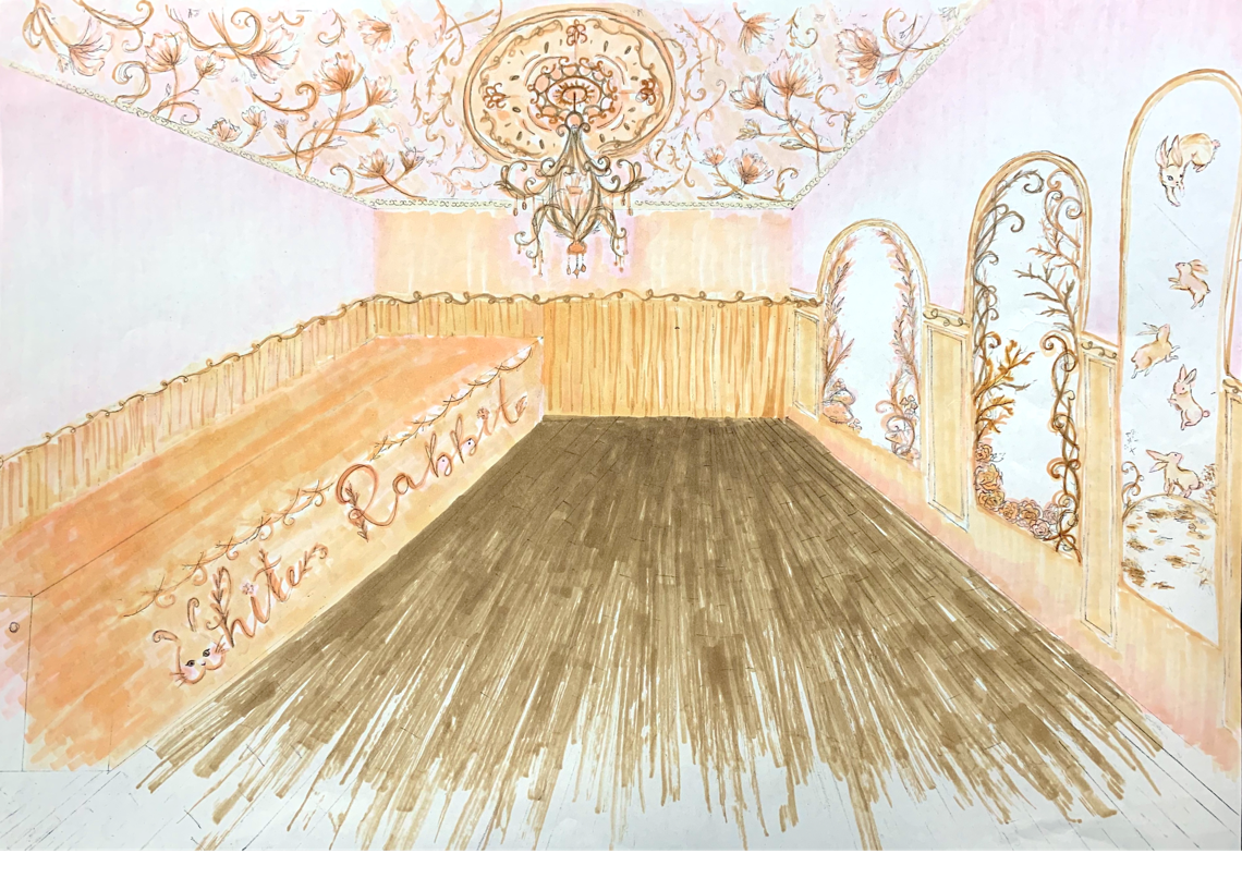
During this term, I have developed my skills as a graphic designer. In the first week or so into the project, I did struggled a little. Even when I knew I was going to rebrand the White Rabbit Teahouse and redesign their logo and possibly their products, I was not sure which direction I was going or should go. I didn’t know what I associated with “graphic design” was only the tip of the iceberg. Before the project, I have always thought graphic design only does logos, posters and typography. I didn’t know I could design the interior, create actual products and merchandise. I had no clue within the field of graphic design. Luckily I found my way throughout the project.

There was a lot of workload given within and outside this module, as a result, I have learned to balance each module and ameliorated my time management skills. Research and analysis are the fundamental principle to the project, I have developed a wide range of skills for the generation and ideas such as evaluation, selection, change, refinement. However practical works are just as important. Our tutor have always emphasised the significance of practical works throughout the course. Hence, I have also expanded a range of practical art and design skills.

During this module, I have learned to study and research independently, in order to become a more effective individualistic learner. Additionally, I have strengthened the confidence in expressing my own thoughts, ideas and viewpoints.


-FINAL DESIGNS & PROCESS-

-LOGO DESIGNS-

-POSTER DESIGNS-

White Rabbit original advertisement / poster design
Final poster design

First of all, the typography was too thin therefore I drew it with thicker brushstrokes. Second, the pink address does not really match well with the beige background, so I’ve changed it into a pale orange colour. Third, I have added the lace print to the background since I find the background to be a little plain.

Final poster design

I wanted to incorporate the tea set photo in the poster so I did a few tries.

Initial idea
Refinement: Included rabbit illustrations + changed the font
Experimenting with different background
Final poster design
Before refinement
The rabbit heads on the top was too much so I did some adjustments

The background of the poster was a bit simple, therefore I’ve incorporated the lace print in order to add texture. I did a few tries but ended up liking the first one best.

-MENU DESIGNS-

White Rabbit’s original menu
Initial menu cover design
Improvement
Refined version (misspelt “rabbit” as “rabbt”)
Final cover design with correct spelling

The contents of the menu

-PRODUCT DESIGNS-

Photoshopped my designs on paper bags and t-shirt mockups
My designs on paper tags, booklet and photo frame mockups

-PROJECT STATEMENT-

Today we did a lecture on forming an interesting project outline statement for the portfolio.

WHAT IS A PROJECT STATEMENT-

A project statement is a brief paragraph outlining my project concept. It should be a short paragraph (around 100-150 words) that explains my project concept and relates to the project brief. It should be placed after my contents page in my portfolio, before the images of my development work. It should include my reasons as to why I have chosen this project in connection to the project brief as well as an explanation of my design concept.

STRUCTURE OF A PROJECT STATEMENT-

  1. Introduction of my project
  2. An explanation of reasons why I have chosen this building/shop/product
  3. Discussion of my concepts / theme within my designs
  4. Discussion of problems that I wanted to resolve in my designs

SENTENCE STARTERS

  • The (aim / goal / purpose) of my project was to (investigate / explore / discover)
  • My designs (question / examine / reflect / analyse ) upon the concept of… because I wanted to (communicate / convey / illustrate)

-MY FINAL PROJECT STATEMENT-

“It’s always tea-time.” – Lewis Carroll, Alice in Wonderland. ​

My project aims to re-brand The White Rabbit Teahouse located here in Nottingham City Centre. My designs reflect upon the concept of teatime, since I wanted to disseminate the old English custom of having afternoon tea, to promulgate the delight and euphoria as well as indulge oneself in a little bit of British tradition. I wish the public would dedicate an hour or so, to savor and relax through the ceremony known as afternoon tea. As the hustle and bustle of urban life gets overwhelming at times, I hope to ease off the pressure from being an urbanite, to escape from the hectic lifestyle and come to the wonderland. My designs pursue to retrieve the charisma and elegance of teatime for the community. ​

Based on my observation, the following essentials could be further enhanced: ​

-Logo, typography and graphics ​
-Interior design (e.g. wallpapers)​
-Advertising and promotion (e.g. posters, boards, signs) ​
-Include a broader variety of merchandise and products for sale​

-TEAHOUSE / CAFE RESEARCH –

I have visited a couple of teahouses and cafes here at Nottingham City Centre for inspiration and research purposes.

-WHITE RABBIT TEAHOUSE-

I feel like the interior for the White Rabbit Teahouse is a bit plain, however it feels like a cosy, little cottage. I love the window display as well as the illustrations the most.

-BSWEET-

The Bsweet cafe is set in a tiffany blue theme featuring white blooms everywhere. The interior is a floral delight, it is fresh, elegant and gorgeous. I love the combination of the turquoise colour scheme with the white flowers entwined throughout the cafe.

-GIARDINO-

When I first stepped in, I felt like I’m in Alice’s wonderland. The interior is full of colourful blooms, a mixture of real and artificial flowers, herbs and a real tree, like an indoor garden.

-COSTA COFFEE-

-PORTFOLIO-

We did a lecture on how to effectivity present our works in a portfolio.

The purpose of a portfolio is to showcase a range of my talents, skills and potential. It presents my ability to work with different materials, themes and techniques, as well as how I research, develop and plan my ideas. I should be selecting the best work and include: experiments, sketches etc. into my portfolio. Moreover, the presentation and organisation of a portfolio really matters.

PORTFOLIO

Front cover

-Contents page

-Project statement

-INSPIRATIONS FROM EVERYDAY OBJECTS-

I have searched around Nottingham and my accommodation to look for inspirations for my designs.

BLACKWELL’S

I have found quite a bit of useful materials in Blackwell’s bookshop near the college area.

Hand cream packaging

I like the animal illustrations on the packaging, because I like how the artist didn’t simply drew an animal. Instead, he/she drew a few Bohemian pattern / crochet / tapestry designs on the animals itself. I also feel like the illustrations has attributes similar to watercolour, which makes it interesting to look at.

Post card with a squirrel illustration

This post card is a nice reference image for a observational squirrel drawing.

Cards filled with illustrations
William Morris-esque floral prints

I like floral border as it reminds me of William Morris’s designs. It’s elegant and graceful.

I have also found bits and pieces that I find helpful in various places such as Wilko and through my personal possessions.

Watercolour deer illustration on a mug

Inspiration from trees and vines

The Alice in Wonderland poster has greatly inspired me to design the window display. I took inspiration of the vines and roses from the poster in order to create my window design. I have designed three different windows in the interior perspective drawing. One has mushrooms and leaves, the middle one has vines, branches and roses, the last one has bouncing rabbits.

PERSPECTIVE DRAWING: INTERIOR DESIGN CONCEPT

-INITIAL THOUHT: EMBROIDERY & TRANSFER PRINTING-

I saw loads of embroidered designs and products during the NTU Art and Design degree show, and that has greatly influenced me. Through the inspiration from Alice in Wonderland and Eleanor Higginbotham. I have decided to create an embroidered tablecloth for the teacup and teapot display as well as a transfer print tote bag for my show.

My initial thought was to do a transfer print through a printing shop called Zazzle https://www.zazzle.co.uk or to do it myself by using printing transfer paper on a canvas tote bag. I thought of printing my design on a tote through the school’s printing shop, however they don’t do printing on fabrics. My second option was to do transfer printing by a store online. I searched on the internet and found a printing shop, Zazzle. Nevertheless, it was a little overpriced and I don’t know about the quality on their totes and prints. Eventually, I have come to the conclusion that I am going to create a tote bag by printing using transfer paper and iron.

-PATTERNS FOR WALLPAPER DESIGN-

I started drawing out the floral forms inspired by Alphonse Mucha’s Peonies (1897) in my sketchbook, then proceed to scan the design to my MacBook and arranged them into a pattern in Pages. Once I’ve finish all of my pattern designs and pick a final finished one, I think I could make a product mockup using these designs. After doing a few more tries, I think this prove it further solidify my initial idea.

First attempt – My first try on arranging a pattern

I didn’t really like how the first attempted design has turned out. I feel like the pattern is in an awkward state and the placement of the floral is a little strange. It simply look like I have just created a floral design, copied and pasted then slapped it on the page and called it a design.

Second attempt – Condensed version

The second attempt is a bit better. This time I have arranged it slightly slanted and nearer. It looks a little more delicate and considered.

Third attempt – Larger in scale